
- Published on
Solve the Web image size and resolution problems at once
- Authors

- Name
- AmBob
- @millken2
"use client" import Image from "next/image";
Solve the Web image size and resolution problems at once
Preface
Have you ever encountered these Web image development problems:
The image size does not meet expectations, and I don’t know how to adjust it
The image clarity on some devices is too low, involving device pixel density, resolution, PPI, DPR, physical pixels, logical pixels, and a bunch of concepts that are too complicated to understand
The responsive switching of the image does not meet expectations, and I don’t know how to adjust it
These problems are actually: Image size responsiveness and resolution switching, which is exactly what this article wants to clarify!
Okay, let’s get started now! ^_T
Image
Before we start, I think we should first discuss what images are, which is very important for understanding the following content!!!!
In fact, images are just a carrier of information, which conveys a kind of visual information,
so as an information carrier, It is composed of colored pixel blocks, and different images contain different color and number of pixel blocks,
so the visual information conveyed is also different.
Therefore, an image is determined by the pixels that make it up. When there are more and more pixels, the image will become clearer and the information conveyed will also be clearer, otherwise it will be blurred. Of course, in addition to the image itself determining how much information it contains, how many pixels the specific device can display also determines whether the image is clear!!!
When the browser renders the image, it can be understood like this. The browser will read every pixel of the image, and then decide how to better display the image based on how many pixels our current screen can display (device pixel ratio), so that it can be compatible with the box it is in!!
In this process, we can do some operations, such as controlling two directions:
Image rendering size => Operation box
Image clarity => Controlling clarity
Let's take a look at how to control the size of an image with an understanding of images (it's not that simple!)!
Image size
Note: Please carefully observe the changes in the width and height of the image, which is important for understanding their relationship!
How do we display a image URL or image data in the browser?
The browser provides us with the img tag and the corresponding interface. We usually only need:
<img src="elva-fairy-640w.jpg" />
It's amazing. Now we can see our image directly in the browser.
We don't even give it width and height, it can be displayed automatically.
Now let's make some adjustments to it!
Make the final display width and height 200 * 200
How to achieve this effect?
Directly modify the width and height of the img tag:
// css:
img {
height: 200px;
width: 200px;
}
Nest a div in the outer layer, and then set the width and height of img to 100%
<div>
<img src="elva-fairy-640w.jpg" />
</div>

<style>
div {
width: 200px;
height: 200px;
}

img {
width: 100%;
height: 100%;
}
</style>
The final effect of our code is as follows:

It can be seen that when we adjust the rendered width and height of the image through CSS,
the image will be automatically scaled by the browser!
Moreover, the browser's automatic scaling also exists when our device size changes!
What we are going to introduce below is to solve how to load a picture that best displays visual information under different device sizes!
Images that respond to different device sizes
When you need to respond to different images based on different device widths, you need to introduce the img tag attributes srcset and sizes to provide additional resource images and hints to help the browser choose the most appropriate resource.
<img
srcset="elva-fairy-480w.jpg 480w, elva-fairy-800w.jpg 800w"
sizes="(max-width: 600px) 480px,
800px"
src="elva-fairy-800w.jpg"
/>
For the specific properties, please refer to MDN and we will not repeat them here.
We only need to know that through these two properties, we can tell the browser that we want to use the elva-fairy-480w.jpg picture when the screen width is less than 600px, and the width and height of this picture are in line with our expectations!!
This gives us completely different images on different screen sizes!!
Content responsive images
In addition to setting the image to switch according to the page size, the img tag that wraps the image itself (not clear from the picture above) can also be responsive.
We hope to control the position of the image itself in this box, whether it is retractable, etc. to make the image fill the img tag better!!!!
Here we need to introduce the two CSS properties we want to introduce:
The object-fit CSS property specifies how the content of a replaceable element should fit into the box determined by its height and width.
The effect is as follows:

The object-position property to toggle the alignment of the replaced element’s content object within the element’s box.
Image clarity
The image clarity, here we define it as: The number of pixels covered by the final displayed image, and the final number of pixels we mentioned above,
it actually depends on the browser according to The actual number of physical screen pixels and The number of pixels of the image itself are related!
The key point here is Pixel correspondence, the binary data stream of the image after being parsed one by one becomes one pixel and is corresponded to the pixel on the screen in this way. As long as the number of pixels corresponding to the screen is greater than the pixels of the image after being parsed by the browser, then our human eyes will feel clear!, and as the number of pixels displayed on the screen increases, then obviously, we will feel that the image will become clearer and clearer!!!
Switching images with different resolutions
Here we also need to introduce the srcset attribute mentioned above, the code is as follows:
<img
srcset="elva-fairy-320w.jpg, elva-fairy-480w.jpg 1.5x, elva-fairy-640w.jpg 2x"
src="elva-fairy-640w.jpg"
sizes="(max-width: 600px) 480px,
800px"
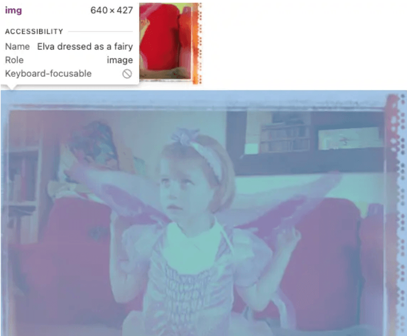
alt="Elva dressed as a fairy" />
<img
srcset="elva-fairy-640w.jpg, elva-fairy-480w.jpg 1.5x, elva-fairy-320w.jpg 2x"
src="elva-fairy-640w.jpg"
sizes="(max-width: 600px) 480px,
800px"
alt="Elva dressed as a fairy" />
Here we swap the order when the device pixel ratio is 1, that is,
the number of pixels that the browser parses the image.
Obviously, 2 is greater than 1, so in the end we can clearly see that the clarity of 2 is higher!!!

Summary and best practices
Follow the steps below:
Confirm what you want to be responsive about the image?
Image size
Directly use srcset + sizes attribute to achieve, easy!
Picture tag + source tag + img to achieve, easy!
Image resolution
- Configure srcset with the corresponding pixel density parameters to achieve, easy!
The size ratio of the image displayed in the container
Modify the display width and height effect of the image content element in the img tag =》Directly modify the width and height of the img tag and the strategy of the image content benefit, easy!
Modify the box that holds the img tag and define the presentation of the img element in the box, easy!
- object-fit
- object-position
- background-position
- background-size
Modify the image direction, scaling algorithm, etc., complex (I will talk about it below...)
Other image operations
Adjust the default orientation of the image rendered by the browser - image-orientation
The property values are as follows:
from-image: Correct the rotation direction of the image according to the EXIF data of the image
Angle size: The rotation value of the image (rounded to an integer multiple of 90deg)
flig: The image is flipped horizontally
Adjust the browser's zoom operation on the image - image-rendering
Trigger conditions:
Each image resource will have its default size, but developers usually specify the width and height of an image. Once the two do not match, the browser will automatically zoom. At this time, we can operate the zoom through the image-rendering property.
The property values are as follows:
auto: Default zoom rule
smooth: The image should be zoomed using an algorithm that maximizes the objective perception of the image
high-quality: In addition to objective perception, high-quality zooming is prioritized
crisp-edges: The image must be scaled using an algorithm that preserves contrast and edges in the image, and that does not smooth colors or introduce blur in the process. Suitable algorithms include the nearest-neighbor algorithm and other non-smooth scaling algorithms, such as 2×SaI and the hqx-** family. This property value is suitable for pixel art, such as images in some web games.
pixelated: When scaling up the image, the nearest-neighbor algorithm is used, so the image looks like it is made up of large blocks of pixels. When scaling down the image, the algorithm is the same as
auto.
Set the image resolution - image-resolution
Note: First of all, this property is experimental, do not use it in production
By default, the browser will render the image to the page according to the naturalHeight and naturalWidth of the image, but we can use this property to adjust the correspondence between physical pixels and CSS pixels px
- from-image: the default image resolution
- specific value: specify the corresponding resolution
- combined: default to the image, no specific correspondence